
Book Scents and E-Reader Sense (Part 2)
Friday, June 16, 2017

By Jen Gosett, BS, CTRS, MATP Staff
Have you ever tried to read something (book, flyer, art print, etc.), but found the font or script was difficult to make out? Sometimes efforts to market in unique and eye-catching ways can obscure the original message.
After a recent update on my Kindle Paperwhite e-reader, I noticed something new: I had the option to choose to read my e-books with the entire font of the book changed to “OpenDyslexic”.
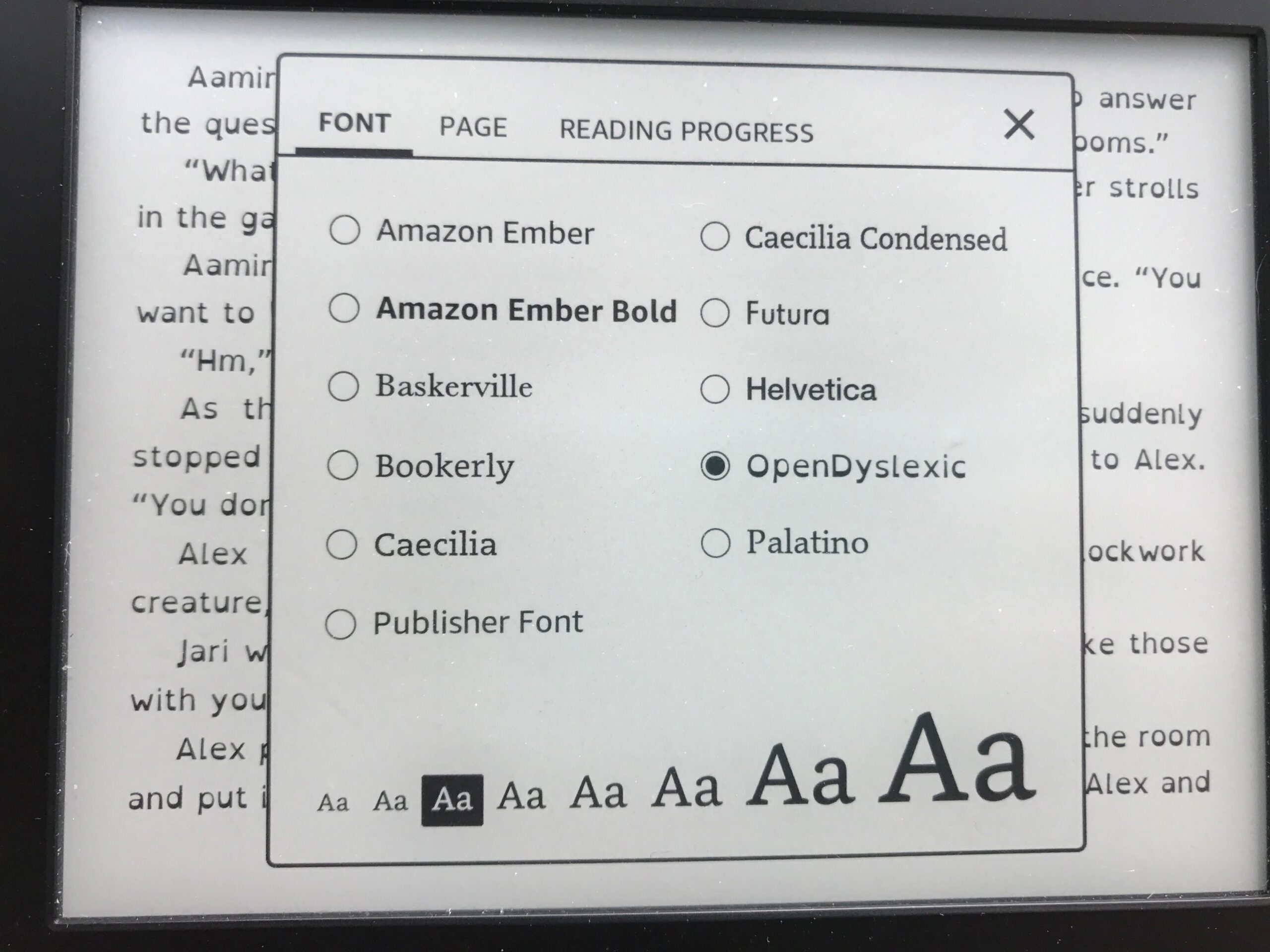
Upon first glance, this font reminded me of the groovy 1970’s era. After a little research, I learned why OpenDyslexic looked so much different from other fonts. “OpenDyslexic is created to help with some of the symptoms of dyslexia. Letters have heavy weighted bottoms to indicate direction. 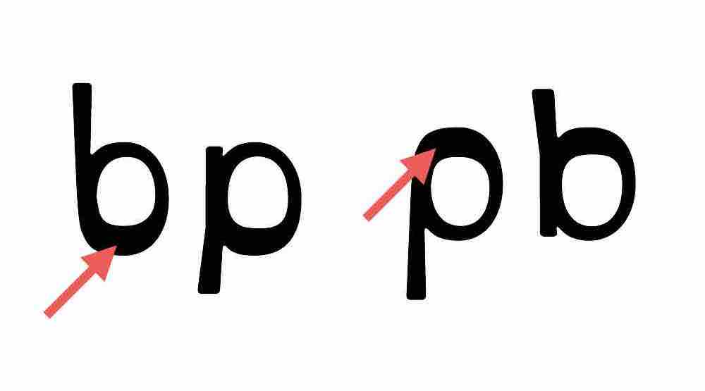 You are able to quickly figure out which part of the letter is down which aids in recognizing the correct letter, and sometimes helps to keep your brain from rotating them around. Consistently weighted bottoms can also help reinforce the line of text. The unique shapes of each letter can help prevent confusion through flipping and swapping. OpenDyslexic also has other features, like wider letter spacing and a unique italic style.”
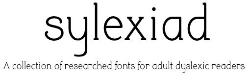
In doing a little more research, I found that OpenDyslexic is not the only font out there created to specific support those with Dyslexia. “The Lexie Readable font was designed with accessibility and legibility in mind. Features like the non-symmetrical b and d, and the handwritten forms of a and g may help dyslexic readers.” And Sylexiad fonts are “a collection of researched fonts for adult dyslexic readers. Developed by Dr. Robert Hillier, a Senior Lecturer at Norwich University of the Arts. The research involved the design and testing of a new font family developed and informed from a dyslexic perspective against other fonts recommended by dyslexia organizations. For the majority of those adult dyslexic readers tested, the evidence indicated a clear preference for the Sylexiad fonts.”
You may now be thinking, ‘interesting, but do these fonts really help?’ ![]() The answer, like many things in life, is debatable. I shared my topic for this post with a fellow MDRC AT team member and she forwarded me an article that stated, “there is no evidence that dyslexia fonts help people with dyslexia to read faster and more accurately.” The fonts mentioned in this blog post “supposedly make it easier for people with dyslexia to recognize the differences between letters. The fonts can be downloaded and used for free. But keep in mind that more rigorous research still needs to be done to find out whether these fonts really help with reading. Specifically, these fonts still need to be studied using what researchers call controlled, randomized studies. The studies also need to be published in peer-reviewed scientific journals. ‘Peer-reviewed’ means that the work has been examined and deemed worthy of publishing by independent experts in the field.”
The answer, like many things in life, is debatable. I shared my topic for this post with a fellow MDRC AT team member and she forwarded me an article that stated, “there is no evidence that dyslexia fonts help people with dyslexia to read faster and more accurately.” The fonts mentioned in this blog post “supposedly make it easier for people with dyslexia to recognize the differences between letters. The fonts can be downloaded and used for free. But keep in mind that more rigorous research still needs to be done to find out whether these fonts really help with reading. Specifically, these fonts still need to be studied using what researchers call controlled, randomized studies. The studies also need to be published in peer-reviewed scientific journals. ‘Peer-reviewed’ means that the work has been examined and deemed worthy of publishing by independent experts in the field.”
 Now for my own, personal verdict: As I mentioned in Part 1 of this blog post, I believe I have dyslexia (though I have not been tested for it). I tried out the OpenDyslexic font on my Paperwhite for a few days to see if I could tell a difference. After the novelty of the new font wore off, I felt that I was more distracted by the groovy-looking letters and ended up switching back to my original font (Helvetica). Final thought: I think the fonts mentioned in this post could be helpful to individuals with Dyslexia; it just depends on how the person using it feels.